Jump to content
  • 0

MCM menu text smashed...


mentaltyranny

Question

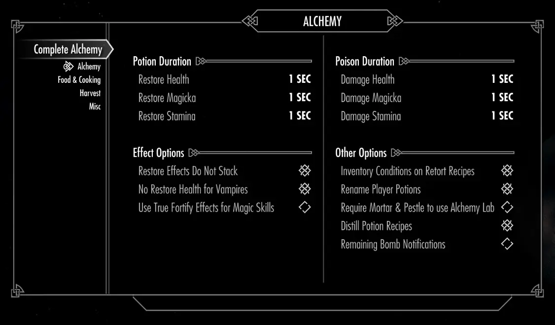
I am having a weird problem, some of the text seems too big the MCM menus in the various mod.  I am using STEP extended and a few magic mods.  But this is my third time modding Skyrim and I don't remember this, even though I had similar mods before about 6 months ago.  Any ideas?  A SkyUI update, maybe?  Here is an example from Complete Alchemy and Cooking Overhaul:


70C70D456428CABEFCEDD4025C09FE1437011947


Here is what it should look like (from the images on its nexus site):


69306-1-1443729875.jpg

Edited by mentaltyranny
Link to comment
Share on other sites

5 answers to this question

Recommended Posts

  • 0

Gonna go out on a limb here... you are using a Font mod as well, aren't you? When you do that, the spacings get changed. The original screenshot was based on whatever font the author used when he snapped it, and yours is definitely different from his - one that takes up more space per letter. Thus, things get longer. It's not a problem - things will still work as they are supposed to. 

Link to comment
Share on other sites

  • 0

Shadriss, I am using the Main Font Replacement mod that is in STEP only. I am using the STEP recommended setting of Fertigo Pro as well. I Just don't remember happening during my old setup with the same mod 6 mo. ago. I will try reinstalling when I get back from work today, but I really doubt it is the problem. Unless everyone else using that mod has the same problem with it and 16:9 monitor with the appropriate BethINI setup?

Link to comment
Share on other sites

  • 0

Mine has always looked like what you posted, Mental. Honestly, my original post was going to be along the lines of "I don't see any problems here." Figured explaining a bit more would make it sound less like a dismissal. I use that font myself, and have numerous places in MCM where that kind of overlap occurs, including in the MCM Mod List as well. It ain't pretty - I agree. But it is working as intended... so to speak.


Honestly, it's pretty easy to see in the Nexus screen you provided that he's using the original font, and on a letter for letter basis, the Fertigo takes up far more room. They design menus based on unmodded fonts, so this kind of thing is really to be expected.

Edited by Shadriss
Link to comment
Share on other sites

  • 0

Mine has always looked like what you posted, Mental. Honestly, my original post was going to be along the lines of "I don't see any problems here." Figured explaining a bit more would make it sound less like a dismissal. I use that font myself, and have numerous places in MCM where that kind of overlap occurs, including in the MCM Mod List as well. It ain't pretty - I agree. But it is working as intended... so to speak.


Honestly, it's pretty easy to see in the Nexus screen you provided that he's using the original font, and on a letter for letter basis, the Fertigo takes up far more room. They design menus based on unmodded fonts, so this kind of thing is really to be expected.

Okay... if you have the same issue it makes me feel better.  I just could have sworn that I didn't have the problem before... Also I was afraid that it was a sign of more trouble later.  I am just building my personal compatibility patch through xEdit, and just started it and looked at the menus and saw this.  Thanks!

Link to comment
Share on other sites

Create an account or sign in to comment

You need to be a member in order to leave a comment

Create an account

Sign up for a new account in our community. It's easy!

Register a new account

Sign in

Already have an account? Sign in here.

Sign In Now
  • Recently Browsing   0 members

    • No registered users viewing this page.
×
×
  • Create New...

Important Information

By using this site, you agree to our Guidelines, Privacy Policy, and Terms of Use.